here is one done with a 2" 120 degree bit


 Senior Member
here is one done with a 2" 120 degree bit
Vector Studio 22
Member
Thanks for the picture Gene, I wonder what is the translation of the name into english? What font is that to get the triangles along the leading edge?
Gerald
Last edited by backyard_cnc; 08-07-2011 at 12:00 AM.
 Senior Member
Chip Carvers are the fellows who lead the way with V carving.
Since they aren't limited by bit angles, they're free to do about anything the imagination leads. I'd suggest looking over this freehand work for sign idea's. Lets not have routing machines hinder creative work. If you embrace the notion of choosing V bits according to letter height you'll be going down the wrong path. The first and most important consideration is letter stroke. The weight of your font sets the bit angle and depth.
Joe Crumley
www.normansignco.com
 Senior Member
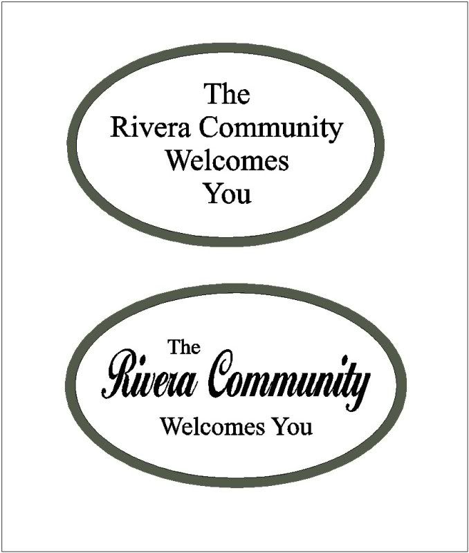
You guys are the greatest, thanks so much for all the feedback. Bradys list of text size vs. bit angle is really a great help that makes sense in my simple brain. The photo that I put on the forum last week was a 1/4 scale sample of just the oval that the customer actually wants. Attached is a concept preview of the whole sign (48" x 36") that is needed, a few changes still need to be ironed out with the customer. We just got the order today and I will post photos of the final full size when we get it done. Thanks again for all the help.
 Member
Rob,
I personally think the sign looks great, but a question. Should there be an s after guest?
Regards and cheers,
Roger.
Senior Member
Rodger, I cant believe I missed that! The customer has seen this and didn't catch it so maybe I could have gotten away with it? But I would rather make it right. Thanks so much!
Senior Member
three freckle ranchOriginally Posted by backyard_cnc

uncey font
Vector Studio 22
Senior Member
OK, we finally found ourselves at the end of this project. Attached is the final outcome. Many thanks to all on this forum for the advise that was given and a special thanks to my girlfriend that did all the painting. We are very happy with the outcome and looking forward to doing more of this work. Rob
Member
Gene,
sorry for delay in response but haven't been around the forum for some time. I like the whimsical in the name 3 freckle ranch but I am guessing it has some personal meaning. The font is very neat and I have downloaded and installed it from the net for use in a project at some future point. Never have to many fonts on hand.
thanks for your input!!!!
Gerald
Senior Member
Rob,
After re-reading my response to your excellent sign, I should probably apologize. It's an attractive example of gilding with black outline. Your outline lady deserves extra complements. Those outlines really make the gold stand out.
What I intended to say the lettering, The font style and letter size being so uniform keeps your viewers eye from settling on your subject line. Most fonts come in Light, Medium and Heavy weight. It's one way to move the viewers eye around the sign..
How to choose a V bit:
Letter height isn't what you should be worried about. Visability is the name of the game. For that reason I seldom use a 60 degree bit. No matter what size the letters. The rule of thumb is to consider the wider bits first. It's the stroke of the letter you need to consider first, not the height. That's certainly the case for Gilded letters, and especially so if they are small. Don't be fooled thinking that shallow letter won't be visible. sometimes you have to stand back to see their affect.
Keep up the good work. It's always fun to see what you're doing
Joe Crumley
www.normansignco.com
Last edited by joe; 02-07-2012 at 09:54 PM.
 Posting Permissions

 Reply With Quote